Scatter plot shows the correlation between Embeddedness score per city and average wage for a chosen occupation and year. Additionally, the plot shows the best linear fit regression line with text showing the slope and the pearson correlation coefficient. You can also see the best fit line with the average slope and average y-intercept for a year. In general, there is a correlation between embeddedness and average wage. The tool tip shows the city, percentile of the embeddedness value across all occupations in a city and total employment in a city. The top 5 cities with high total employment are marked with red filled dots in the graph.

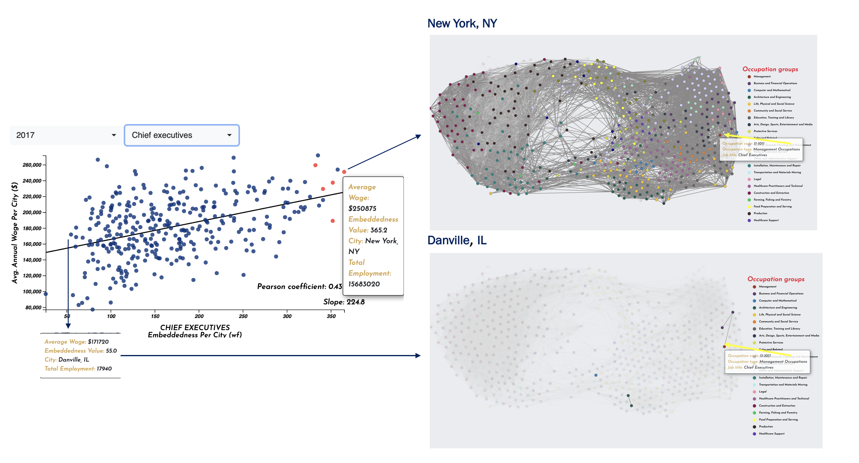
This screenshot provides context for the occupational embeddedness of Chief Executives. An occupation has higher embeddedness in a city when the occupation shares many skill requirements with other occupations in a city's job network. For example, Chief Executives are highly embedded in New York's job network but not well embedded in Danville's job network. In general, analysis reveals that the size of a city's job network does not explain the embeddedness wage premium observed.